My father gave me a Samsung Galaxy A30 in 2019. Four years later the volume rocker stopped coming back up. Not the plastic — the dome switch under it, the part no amount of pressing fixes. Media stuck wherever it happened to be. A call came in at whatever the ringer was last set to. The phone worked perfectly in every other respect.
The repair quote was most of what the phone was worth. So on 25 May 2023 I started writing something that would put the volume control on the screen instead, for exactly one user. That app is Gesture Volume, it has since been installed more than ten thousand times, and it has a 3.55 star rating that I think is roughly fair.
This is the whole story: what the alternatives were and why none of them worked, what Android makes hard about an overlay, what the reviews taught me, and what the app grew into on the way.
What was already available, and why none of it fit
The first thing you do with a broken button is look for a way not to write software.
The quick settings tile. Android has a volume control two swipes away in the shade. It works, and it is a terrible answer for something you do forty times a day — every one of them now a pull, a tap, a drag and a dismiss, and none of it possible while something is full screen.
The Accessibility Menu. Android ships a large on-screen assistant menu with volume buttons in it. It works too, and it takes over a third of the screen to do it.
Assistant voice commands. Fine in a quiet room, useless in the situation where you most urgently want the volume down.
Remapping another key. There is no other key. A 2019 mid-range Samsung has power and the rocker, and Bixby's button was already gone from that model.
The existing overlay apps. Several. I used a couple for weeks. The problem was never the idea, it was that the bar was always in the way of something — a game, a video, a keyboard — and moving it meant either a settings screen or nothing at all.
What I actually wanted was small: a bar I could put anywhere, that did nothing until I touched it, and that got out of the way when I asked. That is a weekend's work, which is how these things always start.
| Option | Works? | Why it wasn't enough |
|---|---|---|
| Quick settings tile | Yes | Pull, tap, drag, dismiss — forty times a day, and impossible over a full-screen app. |
| Accessibility Menu | Yes | Takes about a third of the screen to hold two volume buttons. |
| Assistant voice command | Sometimes | Useless in exactly the situation where you want the volume down. |
| Remap another key | No | There is no other key. Power, and a rocker that no longer works. |
| Repair the rocker | Yes | Quoted at most of what a four-year-old mid-range phone was worth. |
| Another overlay app | Yes | The bar was always in the way of something, and moving it meant a settings screen. |
Why an on-screen bar is harder than it looks
The naive version — draw a strip, listen for a drag, call AudioManager.adjustStreamVolume — takes an evening. Everything after that is Android telling you what you may and may not do on top of other people's apps.
The window has to be almost nothing
An overlay lives in a window owned by your process, drawn over everything else. From API 26 that means TYPE_APPLICATION_OVERLAY, which is why the app's minimum is API 26 and not lower — the older TYPE_PHONE route was closed the same year.
The important part is that the window has to be the size of the bar and no larger. A full-screen overlay window is the obvious way to get smooth drag tracking, and it is also a window that eats every touch meant for the app underneath. So the window is a sliver, flagged not-focusable and not-touch-modal, and dragging it means recomputing its position and calling updateViewLayout on every move rather than moving a view inside a larger canvas.
That constraint is the reason a separate HandlerGeometry exists in the source at all: where the bar is, how big it is, and which orientation's position is being asked about are questions the window manager needs answered in absolute screen coordinates, repeatedly, while your finger is down.
Something has to stay alive
An overlay is worthless if it dies when the app is closed, which is the whole point of it. Android has exactly two ways to keep a process legitimately running for as long as the screen is on, and Gesture Volume ended up supporting both, because each one costs the user something different.
flowchart TD
  A["Bar must stay on screen"] --> B{"Which host?"}
  B -->|"Foreground service"| C["OverlayService"]
  B -->|"Accessibility service"| D["GestureAccessibilityService"]
  C --> C1["Needs SYSTEM_ALERT_WINDOW"]
  C --> C2["Android requires a notification"]
  C --> C3["No Back / Home / Recents"]
  D --> D1["No notification at all"]
  D --> D2["Unlocks system actions"]
  D --> D3["Costs a scary permission screen"]
  C1 --> E["OverlayRuntime"]
  C2 --> E
  C3 --> E
  D1 --> E
  D2 --> E
  D3 --> E
  E --> F["OverlayController draws one bar"]
The foreground service route is the conventional one. It needs SYSTEM_ALERT_WINDOW for the window and FOREGROUND_SERVICE to keep running, and Android's price for the second is a permanent notification. You cannot remove it. You can strip its icon out of the status bar and sink it to the bottom of the shade, which is what the app's notification setting actually does, but a silent placeholder always remains.
The accessibility service route has no notification requirement at all, and it is the only way to reach the actions Android reserves: Back, Home, Recents, screenshot, the notification shade, the power menu and locking the screen. It costs a permission screen that warns the user this service can observe everything they do — which is an entirely reasonable warning, and one that a certain fraction of people read and then uninstall.
Neither is right for everyone, so both are offered, and an OverlayRuntime sits between them routing commands so that whichever host is alive draws the same single bar. That indirection is the single largest piece of accidental complexity in the app, and it exists because of a platform trade-off that has no good side.
| Foreground service | Accessibility service | |
|---|---|---|
| Permission asked for | SYSTEM_ALERT_WINDOW | BIND_ACCESSIBILITY_SERVICE |
| Permanent notification | Required, cannot be removed | None |
| Back / Home / Recents | Unavailable | Available |
| Screenshot, shade, power menu, lock | Unavailable | Available |
| What granting it looks like | A settings toggle | A warning that the service can observe everything you do |
| Typical reaction | “Why the notification?” | Some people read it and uninstall |
| Survives an OEM battery manager | Neither does. See below. | |
Both columns have a cost the user pays, which is the entire reason both exist. The app hands over between them without the bar blinking out — because the alternative, asking somebody to choose correctly before they have used the app once, is a choice nobody can make yet.
The permissions, and what each one is actually for
| Permission | Why it exists |
|---|---|
SYSTEM_ALERT_WINDOW | Draw the bar over other apps. Granted from a settings screen, not a dialog. |
FOREGROUND_SERVICE | Keep the bar's service running. Brings the notification with it. |
RECEIVE_BOOT_COMPLETED | Put the bar back after a reboot, which is exactly when someone with a broken button cannot reach their volume. |
WAKE_LOCK | Keep the service responsive rather than letting it be parked mid-gesture. |
READ_EXTERNAL_STORAGE | Read resources the handler can be skinned with. |
| Modify system settings | Brightness. Android keeps this one separate from everything else, so it is asked for separately and only if you use it. |
| Accessibility service | Optional. Only for Back, Home, Recents, screenshot, shade, power menu and lock. |
Seven things to explain to somebody who wanted a volume button. This is the part of the app I have rewritten the most times, and it is still the part people get stuck on.
Brightness fights back
Volume is easy. Brightness is a system setting, and writing one has a side effect nobody expects: if adaptive brightness is on, the system overwrites whatever you wrote within seconds, because the ambient sensor disagrees with you. The app turns adaptive brightness off the first time it writes a brightness value. That is a real change to the user's device made on their behalf, and it is the correct behaviour, and it still deserves the sentence of explanation it gets.
The volume dialog is deliberately not ours
When the bar changes the volume, the panel that appears is the system's — One UI's on a Samsung, stock on a Pixel, whatever Xiaomi ships on a Xiaomi. Drawing our own would have looked more consistent in screenshots and been wrong in every other way: it would not match the device, it would not reflect changes made by anything else, and it would be one more thing to keep working across OEM skins. The store screenshots show One UI 5.1 because that is the phone they were taken on, and a note on the listing says so.
Which volume?
Android has a separate volume for media, calls, alarms, notifications and the ringer. A hardware rocker resolves the ambiguity with a rule everyone knows without being told: it adjusts whatever is making noise, and the ringer when nothing is. The bar does the same — there is an AudioStreamResolver in the source whose entire job is that question — and it is still the single most common source of "it changed the wrong thing", because the rule is invisible until it guesses wrong. So the resolver can be overridden and the bar pinned to one stream forever.
From one user to ten thousand
timeline
  title From one broken switch to ten thousand installs
  2019 : A Samsung Galaxy A30, a gift
  2023 : The dome switch under the rocker dies
       : 25 May, first version, XML, one gesture, one user
       : Published to Google Play, almost as an afterthought
  2024 : Rewritten in Jetpack Compose
       : The Deck, the Quick panel, the long-press menu
  2026 : 10,000+ installs, 193 ratings, 3.55 stars
       : The A30 is retired. The app is not.
I used the first version for months. It was XML, it had one gesture, and it did one thing. Publishing it was almost an afterthought: the code was written, the phone it was written for was still working, and somebody else's rocker was going to break eventually.
The reviews average 3.55 across 193 ratings. That is a mixed result and I want to be straight about why, because the reasons split cleanly into two piles.
The complaints that were my fault
"I can't find the bar." The bar hides while its own settings screen is open — otherwise it sits on top of the controls that configure it. Obvious once you know. Completely baffling for the first thirty seconds of using the app, which is exactly the window in which people rate it.
"Too many permissions." Correct, and covered above. What I got wrong was the order: the first version asked for everything up front, including the accessibility service, which reads as alarming when you have not yet seen the app do anything. It is staged now, and each one is asked for at the moment the feature that needs it is first used.
"It changed the wrong volume." The stream resolver, guessing wrong, with nothing on screen to say what it had guessed.
The complaint that was Android's fault
By far the most common bad review is some version of "it stops working after a while". It is also the one I cannot fix.
flowchart LR
  A["Service running"] --> B["Screen off / app unused"]
  B --> C{"OEM battery manager"}
  C -->|"Stock Android"| D["Service survives"]
  C -->|"Xiaomi, Oppo, Vivo, Realme, Huawei, some Samsung"| E["Process killed"]
  E --> F["Bar gone, silently"]
  F --> G["One star: 'stops working'"]
  D --> H["Bar still there"]
Several manufacturers ship aggressive battery managers that terminate background processes regardless of foreground-service status. There is no API to opt out, no callback to detect it, and no way to restart afterwards, because being killed is precisely the state in which you cannot run code. The only fix is the user exempting the app in a settings screen that is in a different place on every one of those brands.
So the app has a Troubleshoot section that walks through it per manufacturer. It helps the people who find it. It does nothing for the person who installed the app, watched it vanish two days later, and left one star — and I do not think they were wrong to.
This is the part of shipping a free utility that nobody warns you about: a meaningful share of your rating is set by decisions made in someone else's firmware.
The rewrite: XML to Compose
The first version was XML layouts and view binding. The current one is Jetpack Compose, Material 3, Kotlin throughout, with Koin wiring it together. The migration was not for fashion, and it was not free.
| First version | Current version | |
|---|---|---|
| UI | XML layouts, view binding | Jetpack Compose, Material 3 |
| Bar appearance | A dozen imperative view mutations | State, rendered |
| Menu, quick panel, deck | Three layouts fighting for one window | Separate composables over shared state |
| Wiring | By hand | Koin, MVVM, coroutines and Flow |
| Gestures | One | Six assignable slots, around forty actions |
| Settings preview | Build, install, look | A preview that matches what gets drawn |
| Where it lives | main | The Compose branch, where everything happens |
The interesting problem is that an overlay window is not an Activity. Compose expects a ViewTreeLifecycleOwner, a ViewTreeViewModelStoreOwner and a ViewTreeSavedStateRegistryOwner on the view it is attached to, and a window created by a service has none of them — the view crashes on first composition. You have to implement those owners yourself, on something the service owns, and drive them by hand. That is what OverlayComposeHost is: the bridge that makes a service-owned window a legitimate place for Compose to live.
What the rewrite bought was worth the fight. The bar's appearance became state instead of a dozen imperative view mutations. The context menu, the quick panel and the deck are separate composables over shared state rather than three layouts fighting for the same window. And a preview that actually matches what gets drawn made the appearance settings — which are the most-used screen in the app — something I could iterate on in minutes.
The XML version is still on main in the repository. The Compose one is the branch everything happens on.
What the app became
It has not been a volume slider for a long time. Once there is a bar on the screen that can recognise gestures, everything else is a question of what you attach to them.
Gestures
Eight slots: single tap, double tap, triple tap, long press, swipe in, swipe out, swipe up, swipe down. Around forty actions to put in any of them. A slot set to None genuinely does nothing, which matters more than it sounds — it is how you stop the bar reacting to a gesture that a game underneath needs.
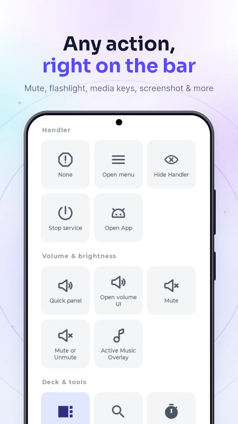
The actions fall into four groups, and the groups are the useful way to think about what the bar can be:
| Group | Examples | Needs |
|---|---|---|
| Handler | None, open menu, hide handler, stop service, open an app | Nothing extra |
| Volume & brightness | Quick panel, open the system volume UI, mute, mute-or-unmute, active music overlay | Modify system settings, for brightness |
| Deck & tools | Open the Deck, search, timer, calculator, torch, QR scanner | Varies by tile |
| System | Back, Home, Recents, screenshot, notification shade, power menu, lock | The accessibility service |
flowchart TD
  T["Touch on the bar"] --> K{"Kind?"}
  K -->|"Tap x1 / x2 / x3"| A1["Assigned action"]
  K -->|"Long press"| M["Menu, or pick the bar up to move it"]
  K -->|"Swipe up / down"| Q["Quick panel: one value, set as you swipe"]
  K -->|"Swipe in"| D["Deck: apps, shortcuts, tools"]
  K -->|"Swipe out"| A2["Assigned action"]
  Q --> S{"Which value?"}
  S -->|"Volume"| V["AudioStreamResolver picks the stream"]
  S -->|"Brightness"| B["Needs Modify system settings"]
The Quick panel
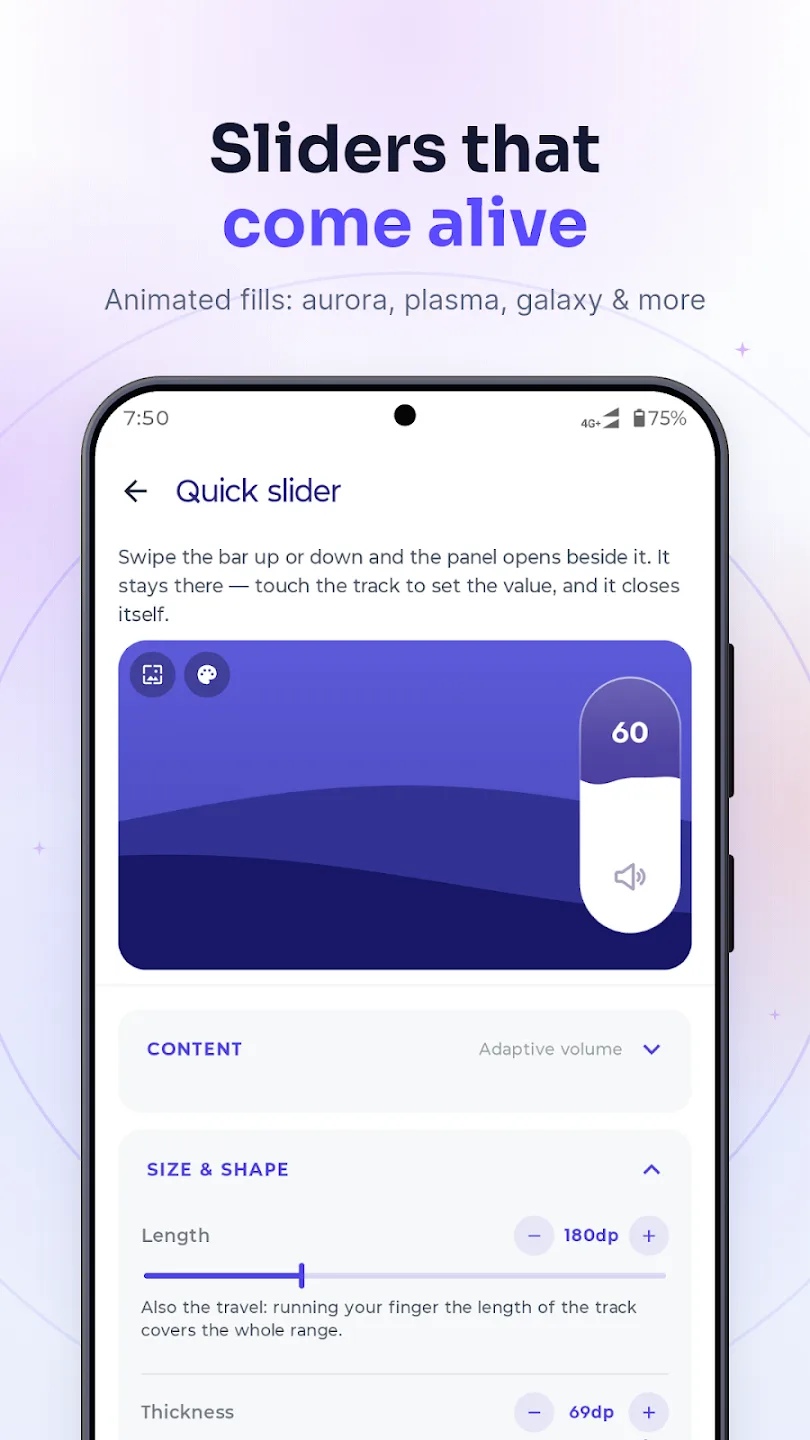
A track that grows out of the bar when you swipe up or down, and the same swipe keeps setting the value — no separate grab. It stays on screen afterwards so you can adjust it again by touching the track directly.
The Deck
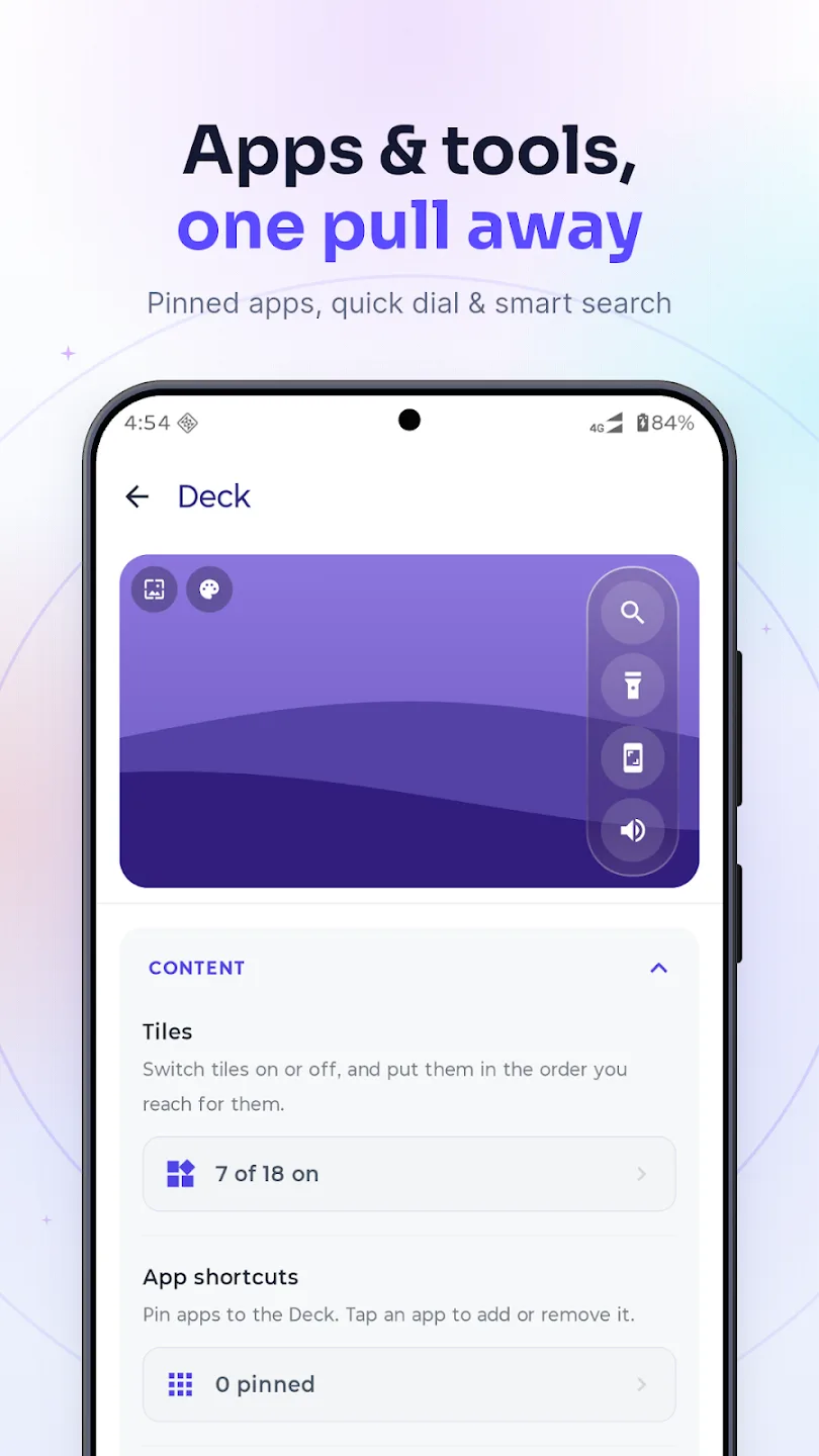
A panel that slides out beside the bar with your apps, your shortcuts, and a set of small tools: search, a timer, a calculator, notes, media controls. This is the feature that has least to do with broken volume buttons and the one I use most. The search box routes what you type — a number goes to the dialler, arithmetic gets evaluated in place, anything else goes to the web — through a SearchRouter and an ExpressionEvaluator that exist for that one box.
flowchart LR
  S["Type in the Deck's search box"] --> R{"SearchRouter"}
  R -->|"Looks like a number"| D["Dialler"]
  R -->|"Looks like arithmetic"| E["ExpressionEvaluator<br/>answer in place"]
  R -->|"Anything else"| W["Web search, or voice"]
Appearance
Position, size, colour, transparency, icon, and a set of presets, of which the useful one is Ghost: near-invisible, still there. The bar remembers a separate position for portrait and landscape, because the place that is out of the way in one is dead centre in the other.
Seven presets ship, and they exist because “configure it yourself” is a bad first answer for something that is already sitting on top of everything you do:
| Preset | What it is for |
|---|---|
| Default | Visible, obvious, findable. The one you start on. |
| Minimal | Thin and quiet, still clearly a control. |
| Bold | A large target — for reaching without looking. |
| Night | Dark and low contrast, for a phone used in the dark. |
| Ghost | Near-invisible and still there. The one I use. |
| Edge | Flush to the side, shaped for a curved screen. |
| Notch | Positioned to sit alongside a cutout rather than under it. |
The long-press menu
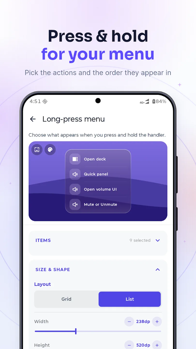
Holding the bar offers a small menu as well as picking it up to move it — hold still for the menu, move to drag. What is in it, in what order, and whether it is a grid or a list, is configurable, because the actions worth having one hold away are different for everybody.
Languages
Fourteen and counting. A broken volume button is not a regional problem.
What I would tell someone building an overlay app
- Size the window to the thing, not to the screen. Every touch you capture and do not need is a touch stolen from the app underneath, and the user will never know it was you.
- Decide early which host you are. Foreground service and accessibility service are not interchangeable, and supporting both is a real architectural cost. Supporting one is a real user cost. Pick knowingly.
- Ask for permissions at the moment they are needed. A permission attached to a feature the user just tried to use explains itself. The same permission on first launch looks like a shakedown.
- Assume you will be killed. Not by Android — by the OEM. Design the recovery path, write the troubleshooting guide, and accept that neither will reach most of the people affected.
- Use the system's UI where one exists. The volume panel you did not draw is the one that will still look right in three Android versions.
- An invisible rule is a bug report. The stream resolver does the right thing almost always, and the almost is what people write reviews about. Anything the app decides on the user's behalf needs a way to see the decision and a way to override it.
It is open source
If you are opening the repository to find one specific thing, this is roughly where it lives:
| Looking for | Start at |
|---|---|
| Keeping the bar alive | OverlayService and GestureAccessibilityService — the two hosts |
| Routing between the hosts | OverlayRuntime |
| Drawing and moving the bar | OverlayController, plus HandlerGeometry for the window maths |
| Compose inside a service window | OverlayComposeHost — the lifecycle, view-model and saved-state owners, implemented by hand |
| Which volume a swipe changes | AudioStreamResolver |
| The Deck's search box | SearchRouter and ExpressionEvaluator |
The decision logic is deliberately kept free of Android types so it can be unit-tested on the JVM, which is the only reason any of it is tested at all — an overlay is close to untestable on a device you do not own.
The source is on GitHub: github.com/imamhossain94/GestureVolume. Issues, feature requests and pull requests are all welcome. If you are looking for the overlay-window and Compose-in-a-service parts specifically, they are under service/ and overlay/, and they are the bits worth reading — the rest is settings screens.
The app is on Google Play, and there is a fuller feature list and a long FAQ on its product page.
The Galaxy A30 is retired now. The app outlived the phone it was written for by some margin, which is not what I expected from a weekend fix for a broken switch.