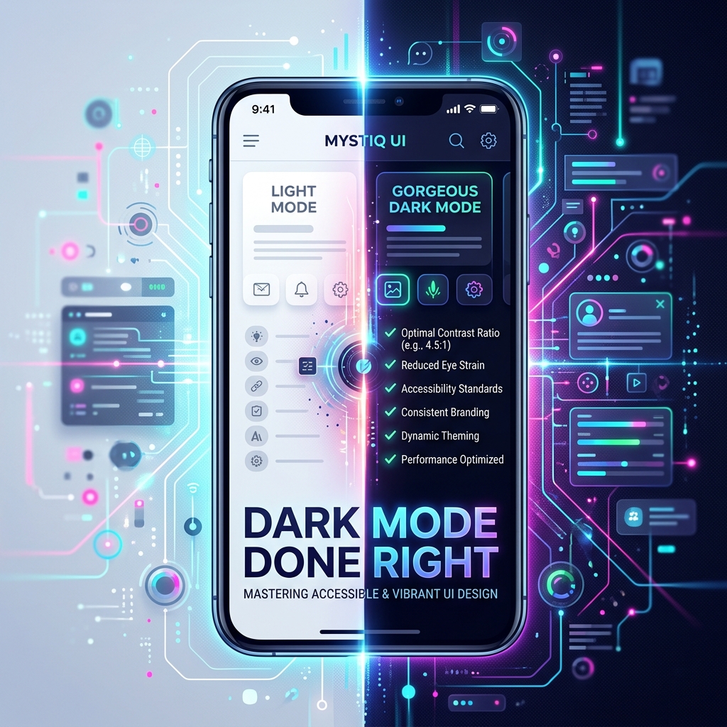
Dark mode looks simple until you actually ship it. Here's the checklist we run through on every screen.
Never use pure black as your background
True black (#000000) next to white text causes heavy halation and eye strain on OLED screens. Use a dark grey (somewhere around #121212 to #1a1a1a) as your base background instead — it's still "dark mode" but far easier to read for long sessions.
Don't just invert — re-check contrast
Inverting colors mathematically often breaks WCAG contrast ratios in one direction or the other. Every text/background pair needs to be re-checked in dark mode specifically, not assumed to inherit the light mode's contrast score.
Elevation needs its own visual language
In light mode, shadows communicate elevation. Shadows barely show up on dark backgrounds. Use subtle lightness differences between surface layers instead — a card should be a few shades lighter than the screen behind it, not relying on a drop shadow that's invisible.
Images and icons need variants
A logo designed for a white background can disappear or look wrong on dark backgrounds. Brand icons, illustrations and empty-state graphics usually need a dedicated dark-mode variant, not just a CSS filter.
Let the system decide by default
Respect the device's system-wide light/dark setting as the default, with a manual override available in your own settings for people who want to fix it regardless of system theme. Forcing a theme that ignores system settings is one of the most common complaints in app reviews.
Test at both ends of the day
The easiest way to catch dark-mode bugs is to actually use the app in a genuinely dark room. Bugs that are invisible at a desk under office lighting become obvious instantly in bed at 11pm.
Dark mode isn't a skin — it's a second design pass. Budget time for it accordingly.